

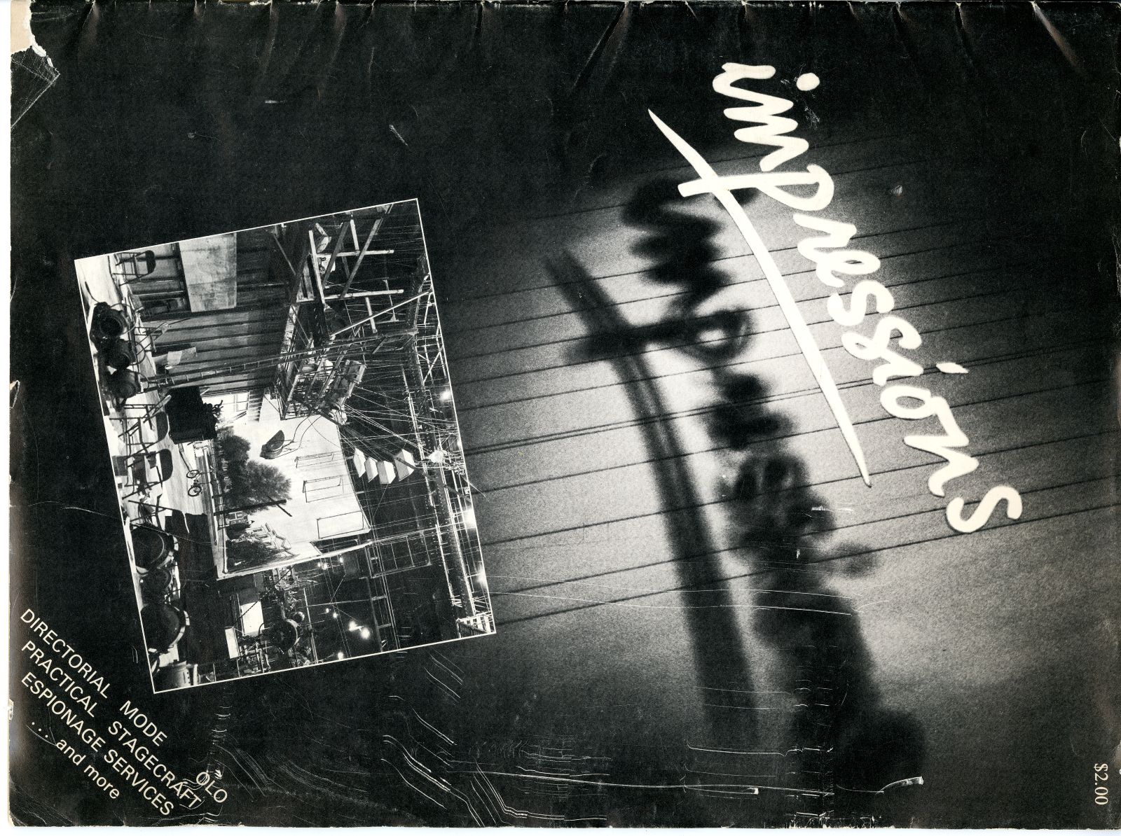

Impressions, the first Canadian magazine dedicated to photography, ran across thirty issues, from 1970 to 1983. I first became aware of and interested in it in 2023, when I took on the role of executive director and publisher of C Magazine, one of the few remaining Canadian mags dedicated to contemporary art and art criticism. C Mag was then approaching its fortieth anniversary and, interested in its origins in the early 1980s, I sought out the first issue.
I was delighted and surprised to find that C Mag was actually much older than we realized: it had evolved, fairly seamlessly, from Impressions. As Rick Rhodes notes in the first C Mag editorial, “C is a revamped and re-named Impressions magazine and it was Impressions… that in recent years gave readers a sample of what a visual-based art magazine could be. C wants to build on that base. We want to be a magazine of both the eye and the mind.” Indeed, though Impressions began as a strictly photo-based mag, it had already evolved into something much more expansive, and was closer to a visual arts journal in form, by the time it transferred its name.
But let’s go back to the beginning. By the early 1970s, there was enough cumulative photographic activity in Toronto to merit the evolution of related institutions. This is the period when photo organizations and publications started to emerge, with many centred in Toronto, contributing to a growing, seemingly exciting international discourse around photography. A lot of the energy around photography at this time was spurred by the National Film Board of Canada’s Still Photography Division, run by Lorraine Monk. It also flowed from the momentum built up by Expo ’67, which included The People Tree, commissioned by the Stills Division—a sixty-six foot high, sixty-five foot wide structure made up of large-scale red-, orange- and gold-toned photographs silkscreened onto nylon, and forming the shape of an enormous maple tree, showcasing hundreds of portraits made by photographers from across Canada. It was a time when questions of national identity, representation and the possibilities of photographic communication felt critical and inextricable.
As the photography industry grew and began to forge specific networks and supporting institutions, regionalisms began to emerge, particularly in Quebec and Western Canada, which no doubt sought identities distinct from the centre of the country, Ontario, and its largest city, Toronto. We can see efforts to acknowledge and celebrate geographic difference and specialness in Impressions; though centred in Toronto, and often featuring work by Toronto photographers, it dedicated an issue each to these regions in its early years. More significantly, as photography communities formed across Canada and made efforts to think about how and why photographic expression might matter locally, regionally and in even broader strokes, many magazines emerged as spaces to share these ongoing conversations. These publications were vital to the burgeoning photographers and artists of the moment, and remain vital, to us today in understanding the special histories, innovations and generous energies of photography in Toronto in the 1970s and 80s.
I want to briefly mention two other photography magazines, Image Nation and Photo Communique, which offered differing models to Impressions. Image Nation, which ran as a photo mag from 1970 to 1983, was published by Coach House Press and edited by David Hlynsky. It was image-led, with limited text contributions, and intended primarily as a vehicle for new creative work. While in its early years, Impressions most often showed discrete artist portfolios, Image Nation instead curated sequences of images thematically in issues like “Women on Women” or “Punk.” Photo Communique, edited by Gail Fischer-Taylor from 1979 to 1988, took an entirely different approach. Truly a mag of the 1980s, it was born of the explosion of critical theory at the time, to which photography was essential. A kind of Canadian October, it was driven not by photographs, but by the ideas to which they pertained. Text-driven, journalistic, intellectual, it covered things like industry news in Canada, changing ideas about the history of photography, and critical debates about the medium. Many of the early issues barely included images at all.
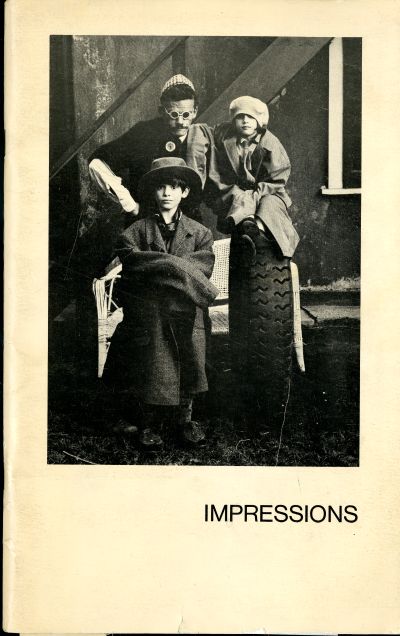
Impressions had two distinct phases, led in turn by the very different visions of Shin Sugino and Isaac Applebaum, though the first issue involved neither. Issue 1, featuring an image by Vince Sharp on the cover, was published in March 1970. The enterprise was initially driven by managing editor Ralph Bendahan and co-editors John Pendergast and John Phillips, who had, with Laura Jones, recently opened the Baldwin Street Gallery, which quickly became a community hub and resource for many Toronto photographers. This first issue included advertising, a brief essay titled “Photography and the Powerless,” and, filling out its pages, a number of artist portfolios, many by those actively making the magazine, including Pendergast, Phillips and Jones, as well as Marian Bancroft and Pamela Harris, among others. The images themselves are all in a documentary style, though some take more creative licence, and presented relatively traditionally within the limits of the size and resources of the mag: all black-and-white images, grouped by artist, with one image to a page. The inaugural editorial suggests that Impressions intended to be a magazine of both images and ideas, though images would be primary and text scant for the first half of its double life.
What is clear and remained true for the next decade-plus, even as the cast of contributors and masthead names changed, is that it was founded by photographers for photographers, with little division among artists, editors, publishers or arts administrators. In a spirit similar to the artist-run centre model, they made the community they wanted and needed. After Bendahan moved on, shortly after the magazine launched, various people kept the ball in the air for the next few issues. Among them was Shin Sugino, who had initially come on board to offer some advice related to his knowledge and experience as a printer and graphic designer. Sugino would soon become editor and chief architect, and shape Impressions’s vision until the late 1970s, when it would change hands and direction again.
During his tenure as editor, Sugino emphasized images, due in part to a firm belief that images could and should communicate without added text, and because, as he told me recently, he more or less did it all himself, and writing wasn’t his thing. Yet what’s most striking about the first half of the life of Impressions under his direction is that it did not develop—perhaps even resisted developing—a consistent or recognizable visual style.
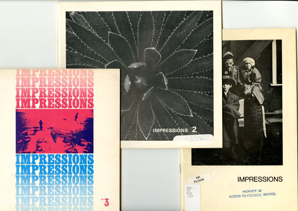
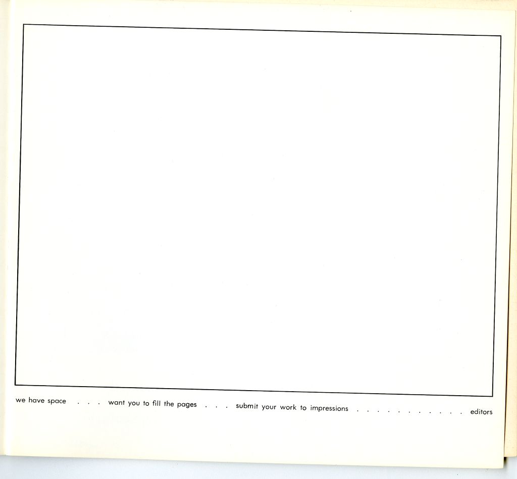
Two consecutive issues were rarely alike, as the magazine changed shape and size, and re-designed its cover style with almost every newly minted issue. The second issue looked nothing like the first—though it did appear strikingly similar to the look of Aperture at the time, perhaps in homage to its more famous American counterpart. Issue 3 changed look again, introducing colour and a more modern design to its cover. Notably, the editorial in this issue references the unintended gap between issues. In its initial years, though billed as a quarterly, only two issues per year were released, in part, it seems, because of a dearth of submitted content. The third issue tried to address this directly, if comically, by presenting an empty framed page and a caption beneath reading “we have space… want you to fill the pages… submit your work to impressions.”
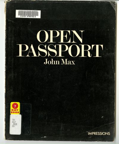
When submissions remained thin, Sugino went out and found content, often forging partnerships, and using the platform to generate monographic records of bodies of work and exhibitions from the era. Given the dearth of arts publishing platforms in Canada, this activity was extraordinarily important as a means of documenting and disseminating significant projects. Impressions produced monographic issues dedicated to the work of Pamela Harris, Michael Simak and Michael Torosian. But perhaps the most well-known issue of the magazine remains John Max’s Open Passport. A collaboration with the NFB, it lives on as issue 6-7 of Impressions, as a monographic book of the artist’s work, as a key example of an early Canadian photobook and as a de facto catalogue of Max’s eponymous exhibition, organized by the NFB’s Still Photography Division and shown at the Photo Gallery in Ottawa in 1972. Known for its innovative approach to narrative and use of multiple images, Open Passport often repeats the same image within a sequence for impact and effect. Unusual and innovative in its time, it remains a touchstone of the possibility of photographic storytelling.
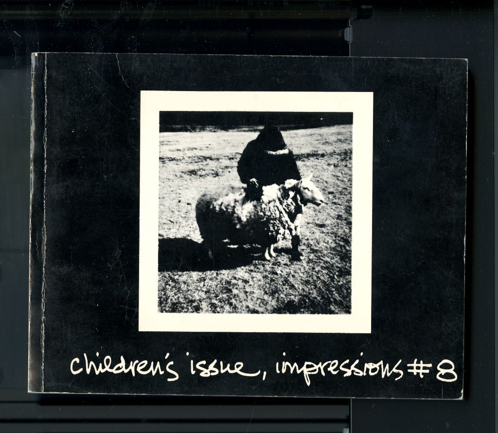
Other partnerships traced in the magazine were also critical to its ongoing existence and serve to tell us about networks and alliances in the photo community at the time. The Children’s Issue, the 8th edition, was a partnership with the NFB Still Photography Division and Ryerson (now TMU). Led by Barbara Lebeau, it showcased the results of an educational project that sent Polaroid cameras to selected schools across Canada, giving selected children a chance to make a set of images showing the world as they viewed it. The resulting photographs were sent back to schools so that kids could look at and discuss them together, showcasing photography as a tool to help children better understand their environments and their perspectives. It’s a whimsical issue, notably much smaller format than any other, sized like a 4 x 6 family photo album. A later issue showcased a more commercial partnership with Polaroid, inviting young artists to go “on assignment,” making images using the new Polaroid 105 P/N film, professional grade peel-apart land film manufactured between 1974 and 1977. In return for the film and content, Polaroid would use the images produced in a special brochure advertising this new product.
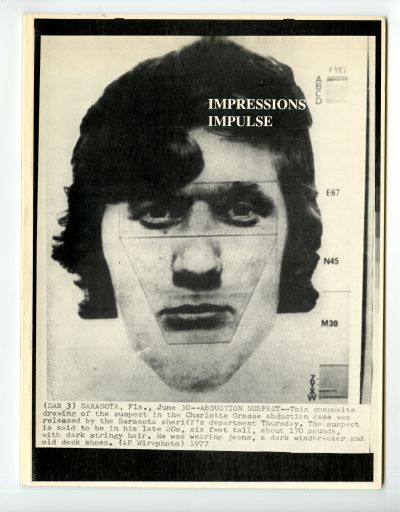
The tenth issue featured the work of Isaac Applebaum on its cover. Soon after, Applebaum came on board as a co-editor, working with Sugino on a few subsequent issues before taking over as editor. Issue 18 marks a kind of crossroads in the history of Impressions. Led by Applebaum and made in collaboration with Impulse magazine, it showcased only news photographs—reproduced press prints—from the era. All the images included were products of the k-300 receiver, a kind of scanning device used by all major newspapers in the late twentieth century to bring in pictures from agencies and to transmit their own photographs all over the world. Receivers of this type would become largely obsolete by the end of the twentieth century, in the wake of digital technology. Unlike the largely monographic presentations of the past, the images presented here are largely unauthored, and the enterprise is much more interested in unusual, even comic, juxtapositions, recontextualizing enigmatic images, and blurring the lines among art, document or commercial activity in the process. The openness to a more chaotic design and wider curiosity about how we read images would become hallmarks of Impressions in the years to come.
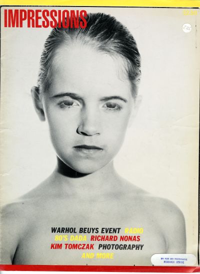
If the first eighteen issues of Impressions, made by a range of artists, editors, designers and collaborators over eight years, were stunningly diverse in format, the balance of issues, numbers 19-30, including three double issues, would reverse the formula, taking on a consistent and recognizable style and format, while introducing new kinds of content and reflecting a wider interest in visual culture at large. Led by Applebaum, with Lorne Fromer working as co-editor on a number of issues, the “new” Impressions appeared on large scale newsprint—cheaper to produce, but also more amenable to image-text relationships, double page spreads, and graphic interventions. The change in visual style to something more peripatetic, even disrupted, conveys a publication less interested in photography’s formal qualities and pretension as art than its persistence in everyday life. This broad interest in the medium’s impact can be seen in the table of contents from the very first newly designed issue, 19: it includes a body of work by Suzy Lake, a conversation with A.D. Coleman, and a quirky group of behind-the-scenes images of Hollywood studios by Robert Cummings, among many other entries.
The balance of issues would continue in this direction, often juxtaposing very different kinds of work without any obvious connecting theme, showing images with text, and often engaging in new graphic design ideas. While earlier editions of Impressions were led by a desire to showcase artist projects and portfolios, these volumes are just as interested in vernacular photography and the culture of the snapshot. It’s also quickly apparent in these volumes that Applebaum’s interests cross over from photography into the realms of writing, sound, wider art histories, and, most notably, in artists working across a range of media. His milieu at the time was no longer the Baldwin Street Gallery; he turned instead to the Cameron House, a place that welcomed and nurtured creative crosscurrents in Toronto. By the time it ceased publication as Impressions, the magazine had evolved into something searching, ideas-driven and not, ultimately, particularly interested in photography as an isolated medium. Long before it became a magazine of visual culture officially, it already operated with these broader curiosities.
What more might this magazine tell us about changing communities and ideas around photography at this moment in Toronto? Its evolution, and continual reinvention, certainly, depended upon a network of community-minded support, an artist-run spirit, not entirely devoid of corporate energy, but never itself corporatized. This grassroots passion persisted for well over a decade and fed a freedom and inventiveness. Impressions embodies a scrappy, youthful sparkle, and the importance of a platform open to experimentation, and even to failure. For many involved, it was a space to try things out, to learn and grow creatively.
I’m left with some thoughts and questions as I continue to look at and consider Impressions, and what we might gain from its existence. The first, and most obvious, is that this era of photography and Toronto’s evolution, including the many extraordinary arts publications of this time, require more dedicated research in order to begin to understand the full shape of this history. The second is a question about the rise of digital culture, and the seemingly weighted decline of print culture. While digital culture offers incredible possibilities for how we can access and share material and modes of making, it doesn’t serve photography in the same way. The openness—and the limits—of the printed page offers a discrete platform that is arguably the most powerful place of encounter for viewers of photographic images. Questions of scale, juxtaposition, texture, image quality, and relation to text can be tightly controlled in a way that is impossible with screen viewing. In educational settings in particular, we’ve devalued print; its expense and physical demands no longer match what we feel they might be worth. I wonder if we’ve got this wrong.
Finally, and most vitally, Impressions offers not only a feeling for the energy of its moment, but also a special way of understanding the past, and its relation to our understanding of the intersecting histories of photography, art and Toronto. If not in magazines, where does this energy live now? What are the shared creative platforms that capture it today? How can we continue to nurture it, engage with it and ensure we are preserving it for the future?